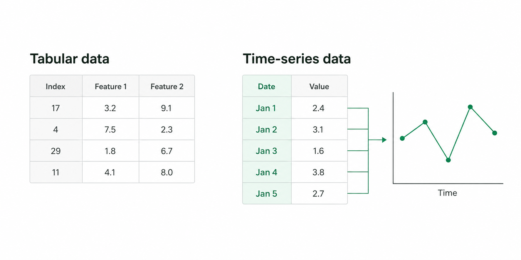
In machine learning, there is no shortage of problems involving time series. In these problems, the order of the data matters: observations made at different points in time may be related. This differs from standard cross-sectional data, where each data point is generally treated as independent from the others.
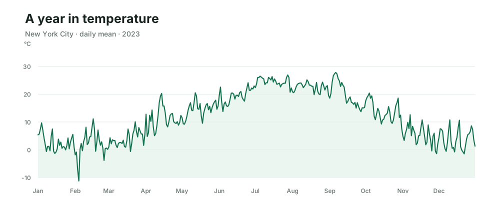
Although time-series datasets can contain multiple features, just like other machine-learning datasets, it is common to begin with a single sequence of values observed at a fixed frequency. One example is the daily average temperature throughout a year.
Daily mean temperature at 2 meters for New York City in 2023. Source: NASA POWER meteorological data derived from MERRA-2.
Most time series can be visualized, and these visualizations often reveal clear patterns. There may be a trend, indicating the general direction in which the values are moving. Sometimes the series increases or decreases over time; in other cases, it remains around approximately the same average.
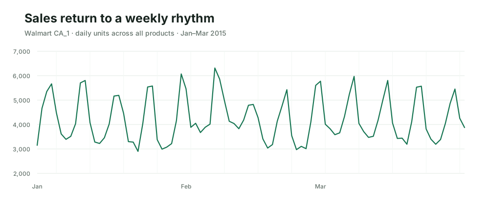
A series may also contain seasonality: patterns that repeat at regular intervals. Weekly seasonal movements, for example, are common in sales data because consumer behavior often changes systematically across the days of the week.
Daily units sold by Walmart store CA_1, summed across all products. Source: M5 Forecasting dataset, published by the University of Nicosia via Zenodo.
In many cases, as in the example above, we can do more than identify these patterns. Our minds can naturally project them into the future. When trends and seasonalities are clear, forecasting can feel like simply “continuing the line.”
Machine learning offers a wide range of methods for automating this task. Before thinking about how future observations relate to the present, however, it is useful to examine how the observations we already have relate to their own past.
If we can understand how previous values influence—or at least provide information about—the present, we may uncover important clues about how the current state of the series relates to its future. This article focuses on two techniques designed to reveal these temporal relationships.
Scattering time
Scatter plots and correlation
A basic technique for finding relationships in data is the scatter plot. We take two features from a dataset—usually numerical features—and plot their values on an x-y plane.
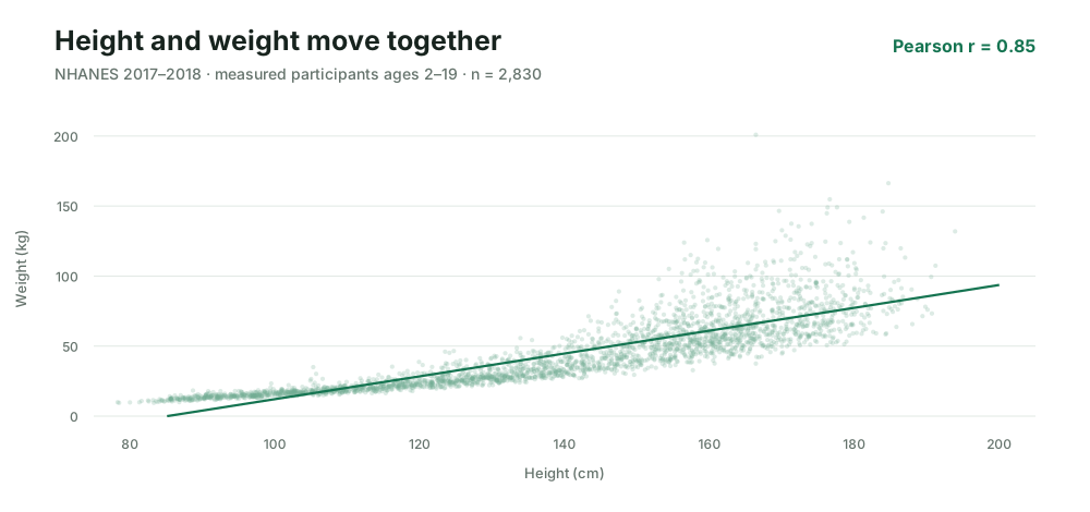
For example, consider a dataset containing people’s heights and weights.
Standing height and weight for all 2,830 NHANES 2017–2018 participants aged 2–19 with both measurements; unweighted sample. Pearson correlation: 0.85. Source: CDC/NCHS NHANES Body Measures.
We can see that the two features have an approximately linear relationship. Taller people tend, on average, to weigh more. The two features are therefore positively correlated. In this example, their correlation is 0.85.
Correlation measures how two features tend to change together.
Positive correlation: when one increases, the other tends to increase.
Negative correlation: when one increases, the other tends to decrease.
No correlation: knowing one feature gives little information about the direction of the other.
The formula is relatively simple. It receives two features and returns a number between −1 and 1. In this article, we will use the following notation:
Here, xˉ and yˉ are the means of the two features.
A simple but powerful consequence of correlation is often overlooked. Regardless of whether one feature causes the other, a sufficiently strong relationship can still contain predictive information.
In the height-and-weight example, if we observe only a person’s height, we cannot determine their exact weight. However, we can make a more informed estimate of their expected weight than we could without knowing their height.
The same principle applies to time series. If past values are correlated with later values, observing the present may give us information about how the series is likely to evolve. Correlation does not guarantee the future, but it tells us whether the past contains a measurable relationship with it.
Time correlation
The kind of simple time series discussed here can be represented as a sequence of values indexed from 1 to T:
x1,x2,x3,…,xT
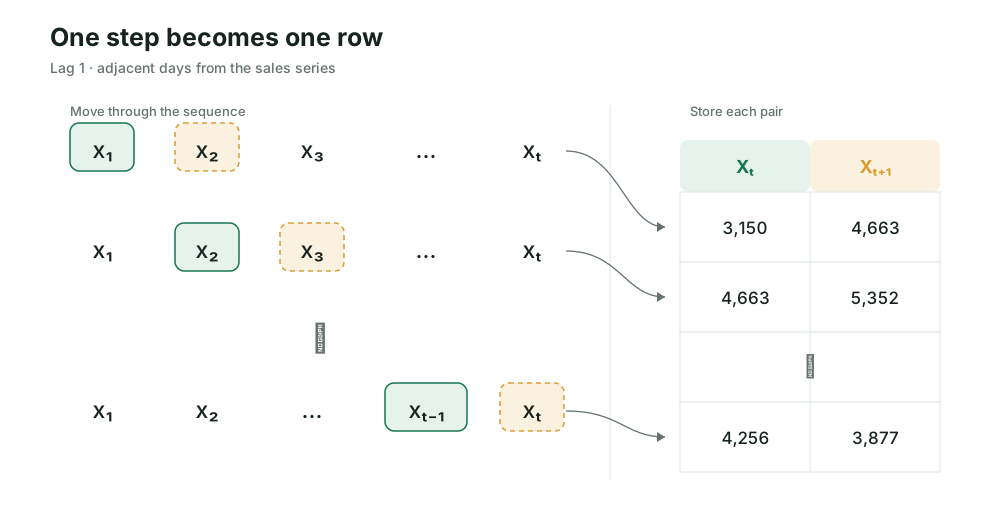
To investigate how the past relates to the future, we can reorganize this sequence into pairs of neighboring observations.
We scan the series and collect every pair
(Xt,Xt+1),
beginning with (X1,X2) and continuing until (XT−1,XT).
At lag 1, each sales value becomes Xt and the following day becomes Xt+1. Table values are rounded for display; calculations use full precision.
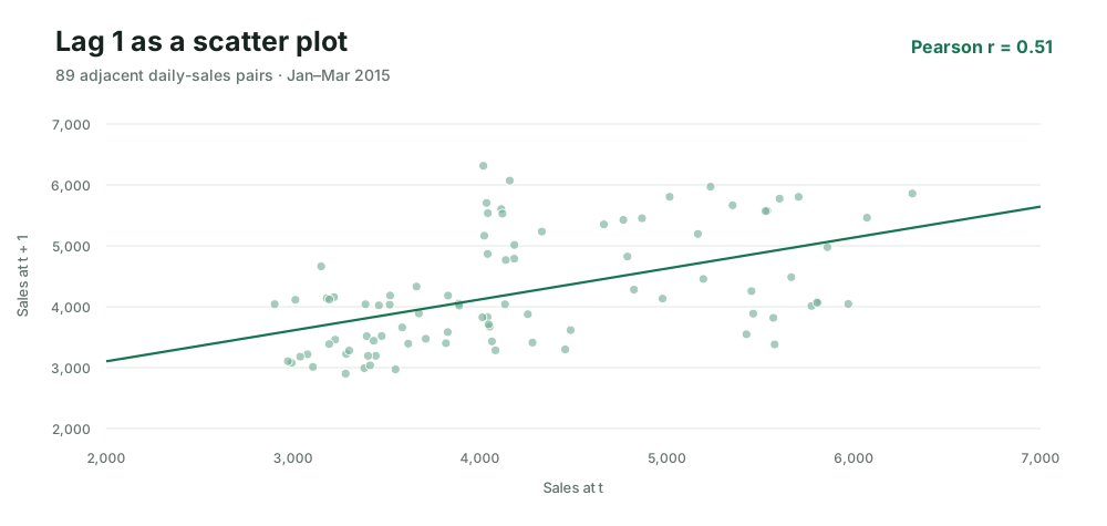
We now have a dataset with two numerical features. We can place Xt on the horizontal axis and Xt+1 on the vertical axis.
Each point is one adjacent-day pair from Walmart store CA_1’s daily unit-sales series. Pearson correlation: 0.51. Source: M5 Forecasting dataset.
As before, the features appear correlated because the points are concentrated around a line. If we calculate the correlation between them, we obtain 0.51.
The difference is that these are not two separate variables such as height and weight. They are two shifted versions of the same variable: one contains the value at time t, while the other contains the value observed one step later.
We are therefore measuring whether large values tend to be followed by large values, whether small values tend to be followed by small values, or whether consecutive observations have little linear relationship.
More lags
Instead of pairing Xt with Xt+1, we can pair it with Xt+n, where n is an integer representing a lag.
A lag describes the distance between two observations in the series.
When n=1, we compare observations that are one time step apart:
(Xt,Xt+1).
When n=2, we compare observations that are two time steps apart:
(Xt,Xt+2).
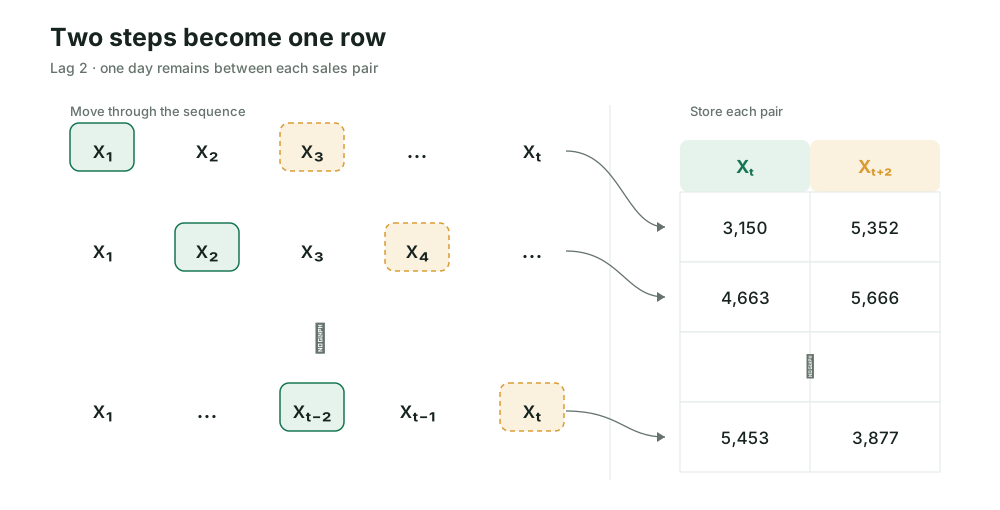
We scan the series as before, but the paired observations are now separated by one intermediate value.
At lag 2, each sales value becomes Xt and the value two days later becomes Xt+2. The value between them is skipped.
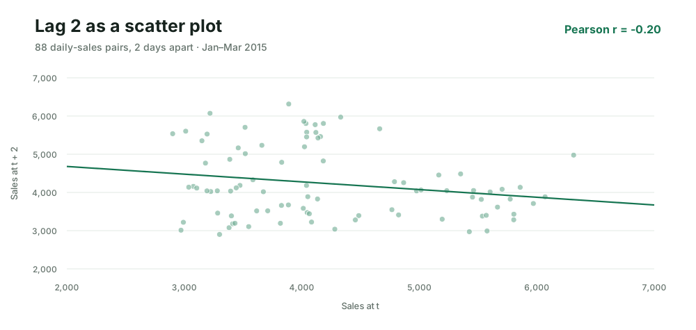
This produces a new scatter plot and a new correlation value.
Each point pairs one day of Walmart store CA_1’s unit sales with the value two days later. Pearson correlation: −0.20. Source: M5 Forecasting dataset.
We can repeat this process for many lags. Beginning with lag 1, we calculate the correlation between observations separated by two steps, three steps, four steps, and so on.
In principle, we can continue until the dataset no longer permits another pair. In practice, we usually stop earlier, once the remaining lags contain too little data or are no longer relevant to the problem.
All time series are finite. For a series containing T observations, calculating the correlation at lag n requires pairs of the form
(Xt,Xt+n).
The second observation exists only when
t+n≤T.
Therefore,
t≤T−n.
At lag n, only T−n pairs are available. As the lag increases, fewer observations remain for estimating the correlation. Correlations at very large lags are therefore based on less data and are generally more uncertain.
Now let us perform this process directly. In the following visualization, you will see the sales time series we have been analyzing and choose the lag used in the calculation.
You will begin at lag 1. Each time you increase the lag, the series will be scanned again, and a new scatter plot will be constructed from the resulting pairs.
On the right-hand side, a bar chart will summarize the results. The horizontal axis will represent the lag, while the vertical axis will show the correlation calculated at that lag.
Run the simulation and observe whether any interesting pattern appears.
Sales over timePair 0 of 89
Lag 1 pairsr = —
Each point places the value at t horizontally and the value at t + 1 vertically.
Correlation by lag0 completed
Lag 1 pairs each observation with the value 1 step later. Drag the scan or run it.
Lag 1, 0 of 89 pairs scanned, correlation —.
Once you have finished the simulation, did you notice that lag 7 has a higher correlation than several of the intermediate lags?
This tells us that observations separated by seven time steps tend to have a stronger linear relationship than observations separated by some shorter intervals. It does not necessarily mean that the value from seven steps ago directly causes the present value. It means that knowing one of these observations provides relatively strong information about the other.
For daily sales data, this result is not surprising. A distance of seven observations corresponds to one week, and the same days of consecutive weeks often exhibit similar purchasing behavior. Mondays may resemble other Mondays more than they resemble the Tuesdays immediately following them.
The visualization may have already suggested this weekly pattern. The correlation calculation now confirms it numerically and quantifies its strength.
This entire process is called autocorrelation. The prefix auto indicates that the series is being correlated with a shifted version of itself.
For lag n, we can write:
ACF(n)=Corr(Xt,Xt+n).
More explicitly, using the same Pearson calculation as the playground, let xˉleft and xˉright be the means of the two overlapping sequences. Then the sample autocorrelation at lag n is
Here, the left sequence is x1,…,xT−n and the right sequence is x1+n,…,xT. The formula is therefore the ordinary correlation formula applied to the two shifted columns constructed by the scan.
The collection of autocorrelations calculated across multiple lags is called the autocorrelation function, or ACF.
The visualization provides an intuition for how the ACF is constructed: shift the series by a chosen lag, pair the overlapping observations, measure their correlation, and repeat the process for additional lags.
The indirect influences
So far, we have used the autocorrelation function to measure the correlation between Xt and Xt+n for different values of n.
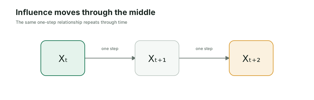
In many time-series processes, however, relationships propagate through intermediate observations. Consider three consecutive values:
Xt,Xt+1,Xt+2.
If Xt helps determine Xt+1, and Xt+1 helps determine Xt+2, then part of the relationship between Xt and Xt+2 may be transmitted through Xt+1.
This does not mean that correlation is always transitive. In general, knowing that two pairs of variables are correlated is not enough to guarantee that the remaining pair will also be correlated. However, in a recursive time-series process, earlier observations can affect later observations through the values between them.
The autocorrelation at lag 1,
ACF(1)=Corr(Xt,Xt+1),
measures the relationship between consecutive observations.
The autocorrelation at lag 2,
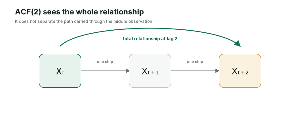
ACF(2)=Corr(Xt,Xt+2),
measures the total relationship between observations two steps apart. It does not distinguish between a relationship that is specific to lag 2 and one that has been propagated through Xt+1.
This raises an important question. If Xt is related to Xt+1, which is itself related to Xt+2, how much of ACF(2) represents a relationship unique to lag 2? Are we partly measuring information that has already appeared at lag 1?
The answer is yes. The ACF measures the complete linear relationship between two observations at a given distance. It does not separate relationships transmitted through intermediate observations from relationships that remain after those intermediate values are accounted for.
We can see this clearly by constructing a simple synthetic time series with only one explicitly defined lag:
Xt+1=0.8Xt+εt+1,
where each εt+1 is sampled independently from a Gaussian distribution. We will initialize the series with X1=1, multiply the latest value by 0.8, add a new error term, and repeat the process.
Build the series1 of 160 observations
Observation 1 of 160. Current value 1.00.
Although the equation contains only Xt, its effect propagates beyond the next observation. Substituting the first equation into the following step gives
There is no separate Xt term in the original equation for predicting two steps ahead. Nevertheless, the influence of Xt reaches Xt+2 through Xt+1.
The same propagation continues across additional lags:
Xt+n=0.8nXt+accumulated error terms.
Synthetic AR(1) seriesPair 0 of 159
Lag 1 pairsr = —
Each point places the value at t horizontally and the value at t + 1 vertically.
Correlation by lag0 completed
Lag 1 pairs each observation with the value 1 step later. Drag the scan or run it.
Lag 1, 0 of 159 pairs scanned, correlation —.
After running the visualization, notice that the ACF does not disappear after lag 1. Even though we defined only a direct one-step relationship, meaningful autocorrelations remain at lags 2, 3, and beyond.
For a stationary process of this form, the population autocorrelation follows
ρ(n)=0.8n.
Therefore,
ρ(1)=0.8,ρ(2)=0.82=0.64,
and
ρ(3)=0.83=0.512.
In a finite noisy sample, the measured values will not be exactly equal to these numbers, but they should be reasonably close when the series is sufficiently long.
This decay reveals how the one-step relationship propagates through time. The ACF at lag 2 contains the relationship transmitted through lag 1; the ACF at lag 3 contains relationships transmitted through the previous observations; and the same pattern continues across later lags.
Now that we know the ACF combines these direct and propagated relationships, a new question emerges:
Can we isolate the relationship associated with a particular lag after removing the relationships carried through the intermediate values?
Removing the influence
To separate direct relationships from the ones carried through time, we need one more familiar idea from machine learning: the residual.
Suppose a linear model predicts Yt from a set of features:
Yt=β0+β1X1,t+⋯+βpXp,t+εt.
After fitting the model, we obtain a prediction Yt. The difference between the value we observed and the value the model predicted is the residual:
et=Yt−Yt.
This allows us to separate an observation into two components:
Yt=explained by the modelYt+not explained by the modelet.
Here, “not explained” does not mean random or impossible to understand. It means only that the model did not capture that part using the predictors we gave it. The residual is useful because it lets us keep what remains after those predictors have done their work.
Before generalizing this idea, consider one lag-2 window from the synthetic series above. Its three observations, rounded for display, are
XtXt+1Xt+2=0.14,=−0.03,=−0.27.
Across all available lag-2 windows, we fit one model that uses the middle value to predict the left endpoint and another that uses it to predict the right endpoint. For this window, those models predict −0.09 on the left and −0.08 on the right. The residuals are therefore
This window contributes the point (0.23,−0.19) to the residual scatter plot. The original endpoints do not enter the plot directly. Only the parts that the middle observation failed to predict remain.
Return now to two observations separated by n steps: Xt and Xt+n. Between them are the observations
Xt+1,Xt+2,…,Xt+n−1.
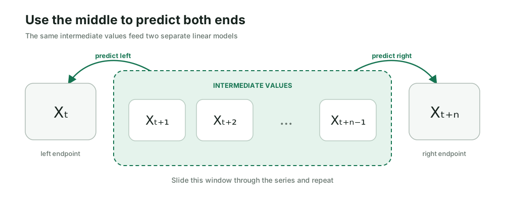
These middle values are precisely the path through which an earlier observation may echo into a later one. So we give them one job: predict both endpoints.
For one window of the series, collect the middle observations into a feature vector:
Mt=(Xt+1,Xt+2,…,Xt+n−1).
Use that same vector in two linear models. One predicts the endpoint on the left,
Xt=f(Mt),
and the other predicts the endpoint on the right:
Xt+n=g(Mt).
Now subtract each prediction from its observed endpoint:
rtleft=Xt−Xt,rtright=Xt+n−Xt+n.
Each window gives us one pair of residuals. The pair contains what the middle could not predict on the left and what it could not predict on the right. These residuals—not the original observations—are the points we place in the scatter plot.
Slide the window forward and repeat. As the highlighted middle values move across the series, each position adds one residual pair. Their correlation is
Corr(rtleft,rtright).
If the residuals still line up, the endpoints retain a linear relationship that the observations between them did not explain. If the cloud loses its direction, the apparent relationship was mostly carried through the middle.
Before you scan
What should remain after lag 1?
The ACF for our synthetic series stayed high at lags 2 and 3, even though the process was defined using only a one-step relationship. Predict what should happen after the middle observations are allowed to explain both endpoints.
Middle values predict both endsWindow 0 of 159 · 0 middle values
Lag 1 residual pairspartial r = —
Only what the middle values could not predict enters this scatter plot.
Partial correlation by lag0 completed
Lag 1 has no middle observations to remove. Scan it first so we have a reference.
Lag 1, 0 of 159 windows scanned, partial correlation —.
At lag 1, there is no middle observation to remove. The residual scatter therefore preserves the same relationship we saw in the ACF, and the partial correlation remains close to 0.8.
At lag 2, the moving band contains Xt+1. Once that middle value is used to predict both Xt and Xt+2, the residual cloud loses most of its slope. The bar falls close to zero. Later lags behave similarly in this series.
This is the distinction we were looking for. The ACF showed that a relationship reaches across several time steps. The residual scan reveals that most of that later relationship travels through the observations in between.
This remaining relationship is the partial autocorrelation at lag n:
PACF(n)=Corr(rtleft,rtright),
where both residuals come from predictions made with the intermediate observations
Xt+1,…,Xt+n−1.
The two functions now answer related but different questions.
The ACF asks:
How correlated are two observations separated by n time steps?
The PACF asks a more specific question:
How correlated are those observations after removing the linear relationships explained by everything between them?
At lag 1, there are no intermediate observations to remove. Therefore,
PACF(1)=ACF(1).
For larger lags, the distinction matters. The ACF sees the entire relationship across the gap. The PACF asks how much of that relationship survives after the path through the middle has been removed.
Reading the echoes
We can now read the ACF and PACF as two views of the same temporal memory.
The ACF shows how dependence propagates. If information enters the series at one point and is carried forward through later observations, its echo may remain visible across several lags. A slowly decaying ACF suggests that this information persists. Spikes that return at regular distances may reveal seasonality. An ACF near zero after a short distance suggests that the linear echo does not travel very far.
This is the ACF’s strength: it shows the total relationship across each gap. Its limitation is that it does not separate a relationship belonging to lag n from one that merely arrived there through the lags in between.
The PACF looks for the relationship added by one particular lag. A large partial autocorrelation at lag n tells us that this lag still contributes linear information after the intermediate lags have been accounted for. In that sense, the PACF is often the clearer view when we want to identify individual lag relationships.
This difference becomes useful when diagnosing two classical families of time-series models.
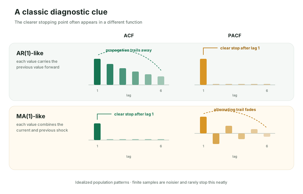
An autoregressive model, or AR model, predicts the present from earlier values of the same series. Because one value influences the next and that influence can continue forward, its ACF often trails away. The PACF may show a clearer stopping point after the lags used directly by the model.
A moving-average model, or MA model, builds each value from the current and recent random shocks. Here, “moving average” names a probabilistic model; it is not the rolling-average smoother often used in charts. Because only a limited set of shocks overlaps across observations, the ACF may show the clearer stopping point, while the PACF trails away.
Idealized population patterns for an AR(1) and MA(1) process. Estimates from a finite sample will be noisier and will rarely stop at exactly zero.
Try one without the labels
Which family does this pattern resemble?
Imagine an unknown series whose ACF fades gradually across several lags, while its PACF has one clear spike and then falls close to zero. Is that evidence more consistent with an AR-like or an MA-like process? What feature of the two plots supports your answer?
This is the classic AR-like clue: the ACF carries the propagated relationship forward, while the PACF isolates the first lag as the main individual relationship. If the ACF stopped clearly and the PACF faded instead, the pattern would be more consistent with an MA-like process.
These patterns are clues, not automatic model-selection rules. Real series may combine autoregressive and moving-average behavior, contain trends or seasonalities, change over time, or produce isolated spikes through sampling noise. The plots help us form a hypothesis; validation and domain knowledge still decide whether that hypothesis is useful.
Their diagnostic value also extends beyond classical AR and MA models. Before modeling, the ACF can reveal persistence and repeated seasonal distances, while the PACF can suggest which individual lags deserve closer attention. After modeling, both functions can be applied to the residuals. If strong correlations remain, the model has left temporal structure unexplained.
This remains useful even when the final forecaster is a state-space model, a tree-based system, or a neural network. ACF and PACF are compact ways to ask whether the past is still leaving a detectable linear signal—and whether that signal is propagated across the series or concentrated at particular lags.
Keep the smallest useful distinction
The ACF traces the echo across time. The PACF asks which lag still speaks after the observations in between have been accounted for.
One difficult idea each week
Get Aflora in your inbox.
One visual article, its central experiment, and a question worth carrying forward. Double opt-in; leave whenever you want.
Measurement is optional.
With your permission, Aflora records pages viewed, active reading time, progress, and lab use. We do not store typed text, network addresses, or session replay. Read privacy details.